12 Tips on How To Optimize Your Restaurant’s Website
Last updated: Jun 15, 2022
With the amount of online competition, it takes more than just owning a website to get ahead. Now more than ever, businesses need a clear, focused website to stand out from the competition.
As a small business owner your time is precious, so today, we are going to look at twelve easy ways to optimize your restaurant’s website and make it more effective for your business and more enjoyable for your customers to use.

1. Decide the Ultimate Action You Want Your Users To Take
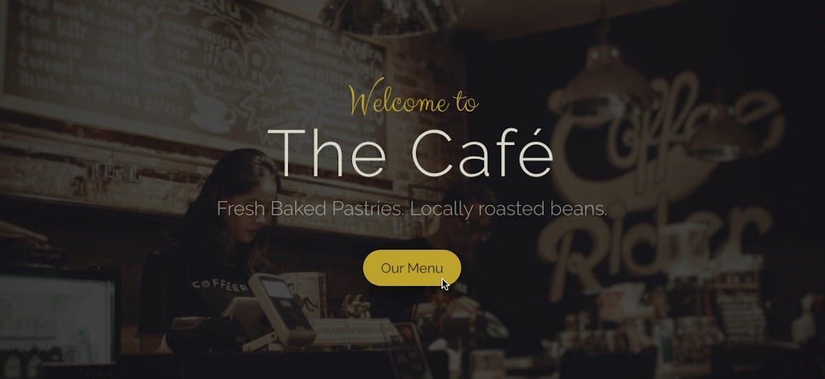
Every website should be made with a goal in mind. Deciding your website’s main goal helps you structure all your content in a way that leads users towards completing that goal. This is what I like to call conversion-focused design.
Telling your users how to complete that goal is called your “call-to-action.” This will be different depending on what type of restaurant you have.
For example, if you have a fancy dinner restaurant you might want your call-to-action to be “book a reservation.” Maybe your website’s objective is to get users to “view the menu” or to have them “call in an order.”
Whatever your call-to-action is, it should stand out from everything else on your page and be consistent throughout your website. For call-to-action buttons, I recommend a bright color that contrasts well with your website’s palette and use that color only for your calls-to-action.
2. Center Your Website around Your Call-to-Action
After you have decided your website’s main objective, write your copy so it reinforces that objective and structure your content so it doesn’t distract from it. Less is more. Cluttered websites look unappealing and often take focus away from your call-to-action.
Don’t pull your users’ focus in multiple directions.
If you have a website already and are looking to improve it, this may mean rewriting copy and deleting unimportant information.
Information that doesn’t guide a user to complete your website’s goal, such as an “about me” section, should be put on a separate page.

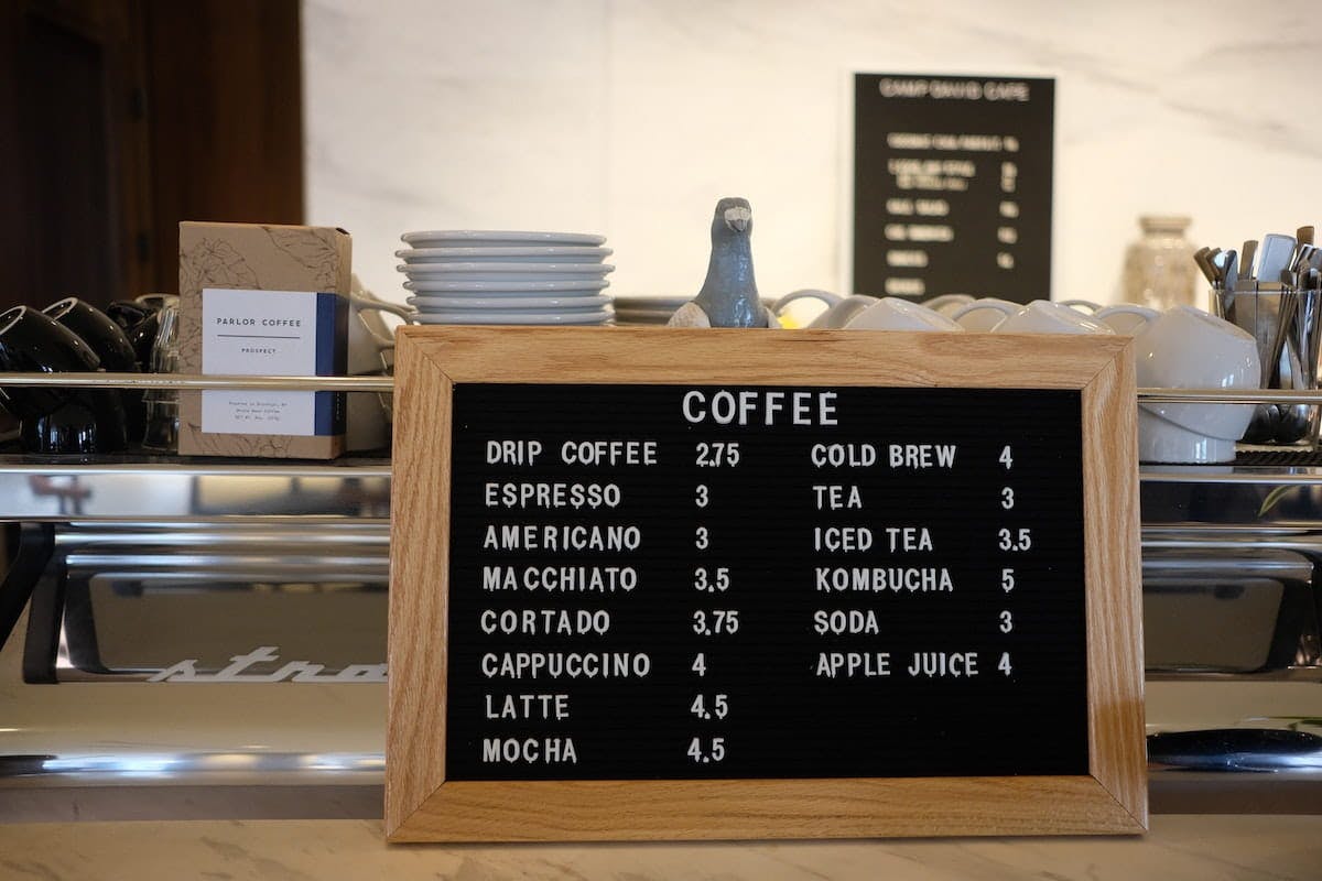
3. Ensure Your Menu Is Present and Optimized for the Web and Mobile Devices
Do you remember the last time you looked up a restaurant’s website? What was the main thing you wanted to get from it? I can’t speak for others, but these two points are true almost every time I am visiting a restaurant’s website.
- I am interested in finding their menu
- I am on my smartphone
Making sure your menu is on your website is a good first step. Next you'll want to ensure it's mobile friendly.
Most Google searches are done on a mobile phone, so a PDF of your menu is just not going to cut it. Having your menu coded on your website is a better option for a few reasons.
- It’s easier to read for mobile viewers
- It can help with search results
- It is more accessible to people who use screen readers

4. Ensure Your Entire Website Is Mobile Friendly
Not only should your menu be mobile friendly, your whole website should be. In today’s world, it is a major disadvantage not to have a mobile friendly website. It is better for you, for your customers, and for Google search results.
As mentioned previously, many people will be out and about when they are looking for your website. That means they'll be looking at your website on their phones.
In addition, websites with a good mobile experience are more trusted by users, and Google ranks mobile friendly sites higher as well.

5. Make Contact and Location Info Easy To Find
There is a good chance people looking for your contact information will end up on your website. Whether they need your phone number for placing a pickup order or your address so they can find your store, make it prominent and easy to find.
Consider adding a “contact” option in your main navigation bar, and your address in the footer of every page. Bonus tip: adding a Google Maps widget to your footer can be very helpful for people trying to navigate to your location.

6. Showcase Pictures of Your Food
When you see pictures of delicious food, you want to eat. It's just science. Bring in the customers by showing off all the delicious dishes you serve. You can post images all throughout your website, add them into a large hero banner on relevant pages, and even create a separate gallery so people can check them out in one place.
If you can afford it, professional photographers will produce the best possible results. However, professional photography can be expensive. Luckily smartphone cameras have come a long way.
If you are taking your own pictures, set your dishes on a simple background and use the natural light that comes through the windows.

7. Add Pictures of Your Restaurant’s Interior
The ambiance of a restaurant is very important to customers. In addition to images of your dishes, get some good shots of your dining areas.
They can help showcase your restaurant’s unique tone. Show off the romantic atmosphere of your restaurant. Have a child-friendly pizzaria? Let everyone see.

8. Add Schema for Rich Search Results
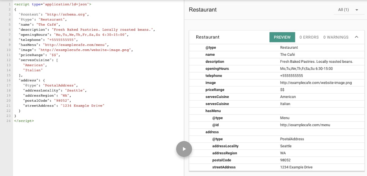
Schema helps search engines, such as Google, better understand your content. By using schema markup, you can help deliver rich snippets to people searching for your business.
Restaurant schema has an option for you to add your menu, which shows it directly in the search results. Find all your schema options here. Examples are provided at the bottom of the pages.
Local Business schema can get your information to users faster. If you run a blog that has recipes on it, use the recipe schema to show cards of your recipes in the results. To test your schema, use Google’s Structured Data Testing Tool.

9. Add Links to Your Social Media
Since food is very photogenic, restaurant accounts generally do well on social media. Putting links to social media accounts is a great way to grow your followers, keeping them engaged with your business even after they leave your website.
Social media allows you to keep in front of your customers. You can create a constant stream of posts by taking pictures of your food. You can feature new dishes and specials, local favorites, how-tos, new blog or recipe posts, and employee interviews.

10. Display Your Reviews
Proud of your hard work? Make it easier for customers to leave you a review. Reviews from other customers are important for establishing trust with your website’s users, so make it easy for people to leave reviews by linking to your GMB or Yelp page.
Once you have reviews, display them directly on your website. Users are more likely to trust your brand if you have good reviews.

11. Include Your Keywords
Keywords make up an important part of SEO. To get the most out of keywords, put them in multiple places on your pages. In the title of your page, in some headlines, throughout the body copy, alt text for images when appropriate and in your meta description.
But be careful not to keyword stuff. Don’t write for search engines, write for real people. Your main goal should be to sound natural to a real, human reader.
Bonus tip: remember to add local keywords when possible. This brings us to our next point...

12. Consider Adding a Blog
Google loves fresh content, and one of the best ways to get fresh content on your website is through blogging.
Whether you call it blog, news, or recipes, having a section on your website where you can add articles you write is a huge benefit. A blog will give you significantly more opportunities to target new keywords and keyphrases. This gives you more opportunities to rank in search results.
You can write all about your new menu items, updates to the business, the staff’s favorite dishes, and even recipes. If, for example, you write about how your coffee shop gives back to your community, you can get your main keywords and local keywords together.
Conclusion
There are many ways to make an effective website for your restaurant. Hopefully this post has shown you a few new ideas on how to create a clear and effective small business website to stand out from the crowd.
If you need help with your online presence, feel free to reach out to us! We'd love to help.
